Inhaltsverzeichnis
Tutorial: Spectral Representations
This tutorial shows how to obtain or illustrate information about the sound character, pitch progression, and rhythm of a music recording using the spectral representations in the Sonic Visualiser.
The Sonic Visualiser is an easy-to-use software tool for visualizing various aspects of an audio file. The basic concept is to layer different visualization layers (layers or panes) on top of each other. Sonic Visualiser was developed at the Centre for Digital Music, Queen Mary University of London, for Windows, Mac and Linux operating systems. The software can be downloaded free of charge and easily installed, see Download. A detailed English introduction can be found here.
Basic functions
Load: An audio file is loaded via the menu, with Crtl-O or with „drag and drop“.
 Please load the file Audio01 to your local hard disk (right mouse button, save target as).
 Open the file in the Sonic Visualiser.
Audio01\ This is an excerpt from the track „Bucephalus Bouncing Ball“ by Aphex Twin, a pseudonym of Irish-British electronica artist Richard David James.
The playback of the file is done with the spacebar or the buttons of the transport menu (above).\ At the very bottom there is also a narrow overview of the audio file that you can click into. Use the horizontal zoom wheel above it on the right to reduce or enlarge the size of the section shown in the main window (alternatively, use the two cursor keys down and up; the cursor keys with the arrows to left and right move the window to the left and right, respectively).\
Use the cursor button (up) to zoom in on the waveform until you see the individual sample points.
The button at the bottom right allows you to change the playback speed (Playback speed); by clicking on the button, you can precisely set the desired speed in a window (as a percentage of the original speed).
After loading, three Layers (visualization layers) are visible, cf. the tabs at the top right:
- scroll layer: Please click on the first of the index cards (on the left) and select scroll so that the visible section scrolls when a file is played.
- The time instants layer contains the time instants of the audio file.
- amplitude layer: Here you can see the waveform. For the corresponding tab, scale can be used to select different scalings: linear, dB (logarithmic) and meter (between linear and logarithmic, often provides the best scaling). In addition, the view can be normalized, i.e. expanded to the range of possible representation.
There are numerous other types of Layers or Panes: time values, notes, regions, text, images, spectrum and spectrogram.
The topmost Layer or the clicked Pane is active. Each Layer/Pane appears as a tab in the upper right corner and has a specific menu there. If you move the mouse over the active layer, information may become visible.
The light (Show, bottom right) can also be used to turn the display of the topmost layer on and off.
Some of the layer/pane have additional information that is displayed in a table when the E key is pressed. This data can be exported as a csv file. (menu: File, Export Annotation Layer). The Layer/Pane itself can be exported as an image file (menu: File, Export Image File). Delete the current Layer/Pane by: Ctrl-D / Ctrl-Shift-D.
Now play the audio file. What sound effects do you notice?
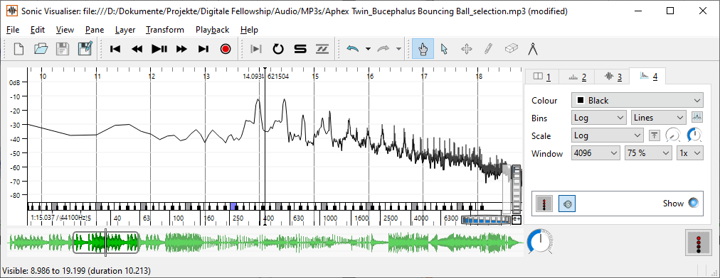
As a first approximation of spectral representation, let's first look at the spectrum, which is a snapshot of the spectral distribution of the recording: You create a spectrum-Layer of the audio file with the key command Shift+U or with the menu command Layer - Add Spectrum - Audio01: All Channels Mixed.
Now select different settings for the size of the analysis window (Window: specified in samples; e.g. 4096 samples corresponds to a window length of 4096 : 44100 = 0.093 - i.e. 93 milliseconds; 8192 samples correspond to 186 ms etc.) at the active tab (top right).
 How does the accuracy of the spectrum change with different window sizes?
 Pay particular attention to the low frequency range.
 Now move the transport window (under the waveform) with the cursor to the right or left.
 How does the displayed spectrum change?
Conclusion: The larger the analysis window is selected, the more accurate the frequency resolution in the spectrum - also in the low frequency range. However, larger windows naturally reduce the resolution in the temporal range. This must be taken into account when choosing the right window size for spectral representation of music recordings.
Spectral Representations
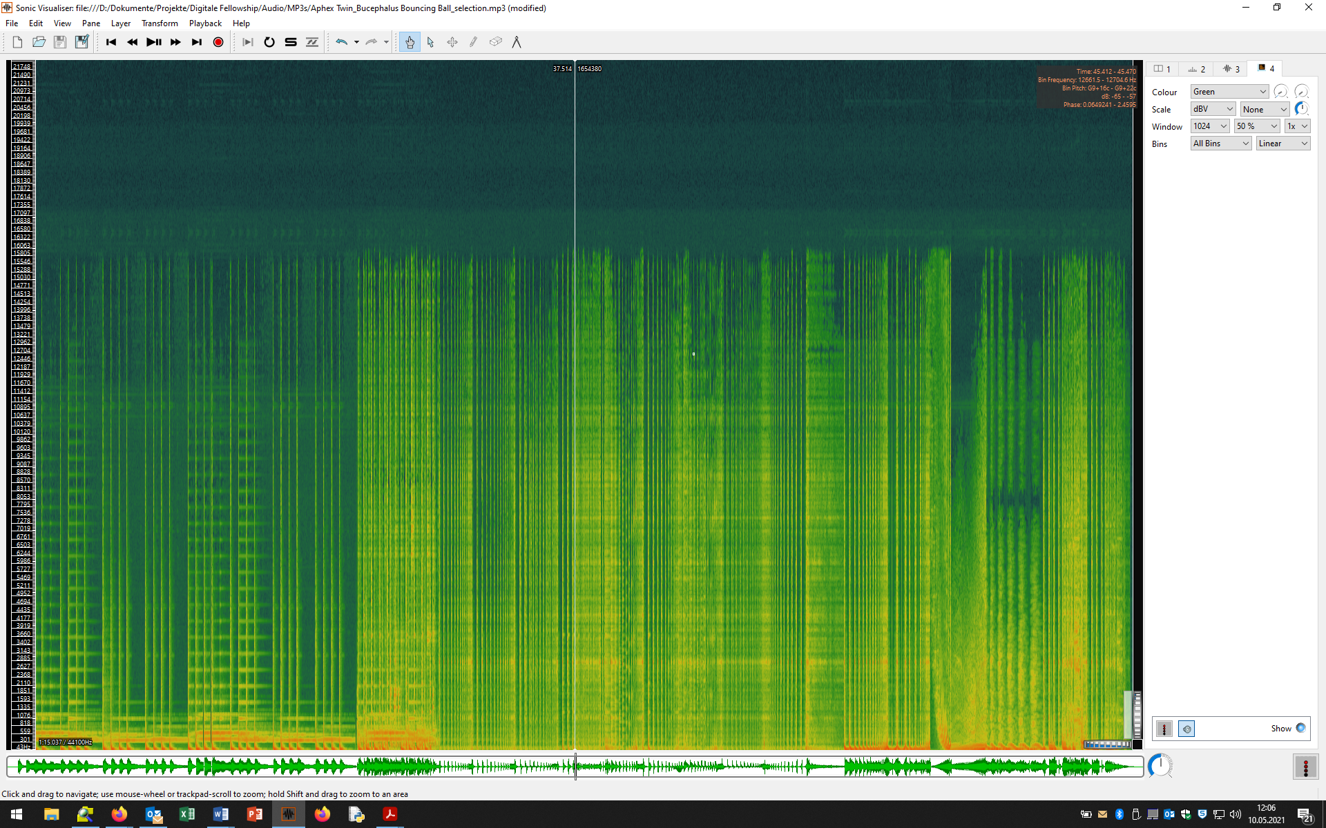
You can create a spectrogramLayer of the audio file with the key command Shift+G or with the menu command Layer - Add Spectrogram - Audio01: All Channels Mixed. Alternatively, you can create a spectrogram below the waveform in a new pane (menu command Pane- Add Spectrogram - Audio01: All Channels Mixed).
 What can you see on the spectrogram?
 Zoom into the image (cursor down)
 Play the audio file. How do auditory and visual impressions fit together?
It is now important to edit the settings of the spectrogram (active tab in the upper right corner) so that it produces as sharp an image as possible of the information it contains. Proceed as follows:
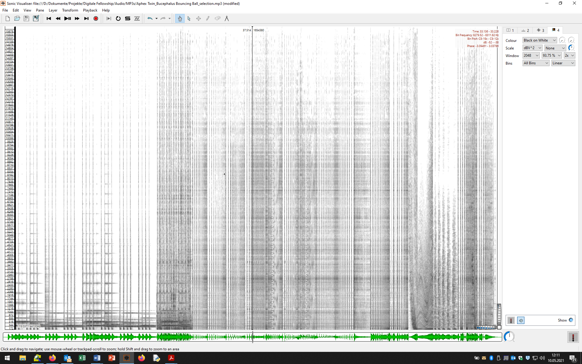
- Choose a color scheme that suits you. In the tutorial, the plain Black-on-White scheme is preferred.
- Then select the display range of the spectrogram by clicking on the range bar next to the vertical zoom wheel and setting the upper or lower limit (Enter new range): The human hearing range starts at about 20 Hz; in the spectrogram, nothing can be detected above 16 kHz for many audio files. So choose a range between 20Hz and 16000Hz; often a much smaller range (<10 kHz or <5000 Hz) is sufficient to illustrate the relevant peculiarities.
- Window: By choosing the length of the analysis window, the image is sharpened (cf. module Basics II: Audio). The window length is specified as the number of samples. Choose different lengths and observe how the display changes. Sharp settings are usually obtained with 2048 or 4096 samples.
- At Window Overlap you set if and how the analysis windows should overlap. A high overlap increases the sharpness of the display, but requires more computing power.
- Scale: Next, you can optimize the black and white or color contrast. Select the setting dBV^2 (lies between dBV and Meter) and adjust the brightness level by turning the wheel to the right of it.
- Bins: Here you can choose between other display forms. Select the pre-installation All Bins and Linear.
 What can you now see on the spectrogram?
 Please also use the zoom option (turn the horizontal wheel slightly to the right).
 Play the audio file again. How do auditory and visual impressions fit together?
Three useful hints for the Sonic Visualiser:
- Once you have found a visually convincing setting for your spectral representation, you can save this setting as a preset (template) for future spectrograms or make it the default for all future spectral representation in the Sonic Visualiser: File - Export Session As Template. The templates are called up via: File - Apply Session Template.
- You can export your spectrogram as image file (png or svg): File - Export Image File / Export SVG file. You can choose between the currently visible section and the spectrogram of the complete audio file.
- When closing the Sonic Visualizer you will also be asked if you want to save the Session. A session contains all Layers and Panes in their association with the audio and can be recalled when the software is restarted.
Rhythm
In the spectrogram, all noisy and percussive sounds, e.g. of the drums, are displayed as vertical bars.
 How can the beginning of the track be characterized in rhythmic terms?
 What happens from 0:28?
Pitch
Tones with perceptible pitch are represented in the spectrogram as parallel horizontal lines, where the lowest line usually corresponds to the fundamental and the higher lines correspond to the overtones.
 Look for tones in the spectrogram! Where are horizontal lines found?
 How do the corresponding passages sound?
Tip: If you move the cursor (hand symbol) over the spectrogram, information about the relevant analysis window is displayed in the upper right corner, e.g. the pitch or the pitch range (with deviations in cents). This way you can check if the horizontal lines are really multiples of a fundamental frequency.
Timbre
The perception of timbre is closely related to the distribution and variation of spectral energy across the frequency range, and is reflected in the spectrogram in varying degrees of gray and black coloration in the corresponding frequency ranges. This affects both the harmonics of a tone (horizontal lines) and sounds (gray clouds).
 Listen to the short passage 0:40-42.
 Here the sound of a percussive sound changes very quickly.
 What can be learned about the character of the sound from the spectrogram?
 Now consider the passage 1:01-05.
 What can be inferred about the sonic character of the passage from the visual representation?
We will delve into the possibilities of visualizing melodic shaping, rhythm, and timbre using a vocal recording in the tutorial Spectral Representation of Vocal Recordings.
Task
 Select a music recording that you find exciting.
 Load the corresponding audio file in the Sonic Visualiser.
 Create a spectrogram of the file. Vary the size of the analysis window.
 Examine selected passages of the recording in terms of rhythmic, melodic and tonal shaping.
 Export the spectral representations of meaningful passages of the piece.
 Describe what is seen in the images.
Deepening
An interesting approach to analyzing the sonic aspects of pop music productions using spectrograms is formulated by Simon Zagorski-Thomas. His thesis is that in many pop recordings the peculiarities of a performance by musicians and singers are exaggerated or artificially designed with various studio-technical means (e.g. equalizer, reverb, panorama, delay) - Zagorski-Thomas speaks of Sonic Cartoons. On the other hand, especially in electronic music, many unusual and 'unnatural' or synthetically produced or processed sounds are used in such a way that they have similarities to the natural sound environment or even conventional musical instruments (e.g. the sound arrangement of a drum set).
Simon Zagorski-Thomas: „The Sprectromorphology of Recorded Popular Music. The Shaping of Sonic Cartoons through Record Production“, in: The Relentless Pursuit of Tone. Timbre in Popular Music, by Robert Fink, Melinda Latour and Zachary Wallmark, New York 2018, pp. 345-366.
![[Sreenshot01] [Sreenshot01]](/lib/exe/fetch.php?w=400&tok=7d8e3e&media=audio01_screenshot01.png)


